CGA Color Palettes
The infamous default 4-color palette with pink, cyan, black and white is probably the first thing that comes to mind when somebody starts to talk about CGA. I previously wrote a post about 16-color modes available for composite monitors but it’s good to add also something about the palettes for RGBI TTL monitors. These started to be used heavily when people stopped using TVs with their IBM PC compatibles.


The CGA palettes were designed for good viewing on NTSC TVs. That’s the reason behind the strange color combinations. The default one can, however, be modified using a video chip register – it replaces pink with red but also disables color burst on the composite output. Such trick was used in many games, but it did nothing on newer cards (EGA/VGA).
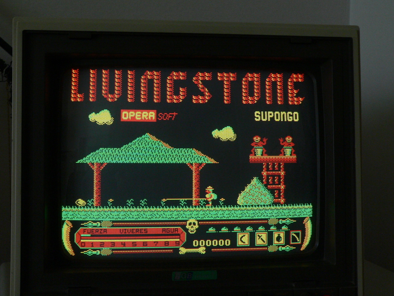
CGA also supports changing the color 0 (usually black) to any other color. Several games used this with the default palette to get blue, cyan, pink and white which allowed for better color transitions. Anyway, the easiest way to get more visually appealing games was to use the second palette – red, green, yellow and black.